Stack
Breadcrumbs let the user know where they've been. Each Crumb component can contain text
or a link to give a quick path back. The component will automatically scroll horizontally
if space is limited.
Without Stack
1
2
3
With Stack
1
2
3
Components
Stack is a standalone component.
Stack
Stack wraps other content. It supports a single props:
| Prop | Type | Description |
|---|---|---|
is | string | Allows changing the element tag. |
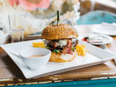
Stacked Images


Code Example
<Code language="vue">
  <pre v-text="'<Button>Touch Me</Button>'" />
</Code>
Stacked Cards
A
B
C
Code Example
<Code language="vue">
  <pre v-text="'<Button>Touch Me</Button>'" />
</Code>
Stacked Cards With Shadows
A
B
C
Code Example
<Code language="vue">
  <pre v-text="'<Button>Touch Me</Button>'" />
</Code>
Stacked Cards With Colors
Notification 1
You have 3 unread messages. Tap here to see.Notification 2
You have 3 unread messages. Tap here to see.Notification 3
You have 3 unread messages. Tap here to see. Code Example
<Code language="vue">
  <pre v-text="'<Button>Touch Me</Button>'" />
</Code>